
Every marketing message needs a destination. Without a clear next step, readers scroll away, visitors bounce, and potential customers disappear before they act. A call to action — commonly shortened to CTA — is the bridge between someone’s interest and their decision to move forward.
Whether you run a small blog, an ecommerce store, or a full marketing department, your CTAs directly influence how many people click, sign up, buy, or get in touch. The words you choose, where you place them, and how clearly you communicate the benefit all shape the result. This guide breaks down what CTAs are, why they work, the different types used across marketing channels, and practical writing tips you can apply immediately.
What a Call to Action Means in Marketing
A call to action is a prompt that tells your audience what to do next. It can appear as a button, a hyperlink, a sentence, or a short phrase — and it typically signals a specific desired action like clicking, subscribing, downloading, purchasing, or getting in touch. CTAs appear in almost every marketing asset: landing pages, emails, social media posts, paid ads, product pages, and blog articles. Without one, even strong content leaves readers unsure what step to take.
Passive Copy vs. Action-Focused Copy
Passive copy describes a benefit. Action-focused copy directs behavior. Consider these two versions:
- Passive: “We offer a free 14-day trial.”
- Action-focused: “Start your free 14-day trial today.”
Both deliver the same information, but the second removes hesitation. It tells the reader exactly what to do and when — and that small difference reliably increases click-through rates.
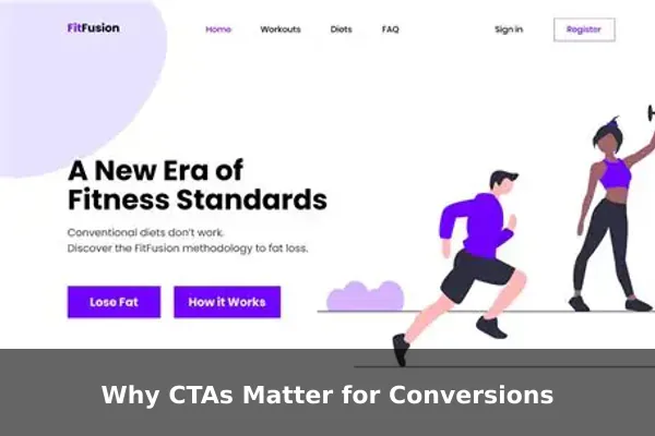
Why CTAs Matter for Conversions
Conversions happen when someone takes a meaningful action — buying, registering, downloading, or contacting you. A strong CTA is one of the simplest levers for improving that rate, and here is why:
- They reduce decision fatigue. When the next step is obvious, people are less likely to pause, overthink, and leave.
- They set clear expectations. A button that says “Download the Free Guide” tells users exactly what they will receive.
- They create momentum. One small action (a click) tends to lead naturally to the next (filling out a form).
- They create measurable conversion points. CTAs give you a trackable milestone to optimize over time.
Without a CTA, a well-written page can still fail to move visitors forward. The content attracts attention, but nothing converts that attention into action.
Common Types of CTAs With Examples
Not all CTAs serve the same goal. Choosing the right type depends on where the visitor is in the buying journey and what action is most appropriate at that moment.
Lead Generation CTAs
These capture contact information in exchange for something valuable.
- “Download the Free Checklist”
- “Get Your Free Quote”
- “Claim Your Free Ebook Now”
Sales and Purchase CTAs
Used when visitors are ready to buy or take a direct commercial step.
- “Buy Now”
- “Add to Cart”
- “Get Started for $9 Per Month”
Sign-Up and Subscription CTAs
Common in email marketing, SaaS onboarding, and membership sites.
- “Join 10,000 Subscribers”
- “Create Your Free Account”
- “Sign Up — It Is Free”
Engagement and Social CTAs
These drive interaction on posts, videos, or community pages.
- “Leave a Comment Below”
- “Share This With a Friend”
- “Watch the Full Video”
Where to Place a CTA for Best Results
Placement is as important as wording. A well-written CTA in the wrong position will underperform regardless of how strong the copy is.
- Hero section (above the fold): Place your primary CTA here so visitors see it immediately without scrolling. Works best when the value proposition on screen is already compelling.
- Within blog content: Mid-article CTAs capture engaged readers before they reach the end and move on.
- End of article or page: Bottom-of-page CTAs convert readers who have consumed all the content and are ready to act.
- Email campaigns: Use one primary CTA per email. Multiple links dilute focus and reduce clicks on the most important action.
- Exit popups: A final CTA triggered when a visitor is about to leave can recover conversions that would otherwise be lost.
A simple rule: every page should have one primary CTA that guides visitors toward the most important goal for that stage of the journey.
How to Write a CTA That Gets Clicks
The wording of a CTA determines whether someone pauses to read it or scrolls right past. These writing principles separate high-performing CTAs from weak ones.
Start With a Strong Action Verb
Verbs drive action. Begin your CTA with a verb that matches what the user will actually do:
- Download / Get / Claim — for content offers and lead magnets
- Start / Try / Join — for products, trials, and memberships
- Schedule / Book / Contact — for services and consultations
Be Specific About the Benefit
Weak: “Submit”
Better: “Send Me the Free Template”
Specific CTAs outperform generic ones because they remind the reader of what they gain, not just what they have to do. The clearer the reward, the lower the barrier to clicking.
Add Urgency Without Being Pushy
Mild urgency improves conversion when it is honest:
- “Get Instant Access”
- “Start Today”
- “Claim Your Spot Before It Fills”
Avoid fake countdowns or false scarcity. When visitors realize urgency is manufactured, trust disappears along with the conversion.
Match the CTA to Reader Intent
A first-time visitor reading a beginner’s guide is rarely ready to book a sales demo. Offer a resource instead: “Download the Beginner’s Checklist.” Save “Request a Demo” for visitors who have already consumed deeper, more advanced content. Matching your CTA to the reader’s current stage dramatically increases relevance and click-through.
CTA Mistakes That Weaken Results
Even experienced marketers repeat these errors. Recognizing them is the first step to fixing them.
- Using vague verbs. “Click Here” or “Submit” give no information about what happens next. Replace them with specific, benefit-driven phrases.
- Overloading with too many choices. Multiple competing CTAs on one page split attention and reduce overall clicks. Choose one primary CTA per screen or per email.
- Low-contrast design. A CTA button that blends into the background gets missed. Use a distinct color that stands out clearly from the surrounding page elements.
- Mismatch between CTA and landing page. If a CTA says “Get 30% Off” but the destination page shows no discount, visitors leave immediately. Keep the promise and the destination fully aligned.
- Ignoring mobile. CTA buttons need to be large enough to tap comfortably on a phone screen. Small or tightly packed buttons create friction and lose mobile conversions.
Quick CTA Formula and Swipeable Examples
A reliable formula for writing any CTA from scratch:
[Action Verb] + [Specific Outcome] + [Optional Urgency or Qualifier]
Applying that formula across different marketing goals:
- “Download Your Free Marketing Checklist Now”
- “Start Your 14-Day Free Trial — No Credit Card Required”
- “Get Instant Access to the Full Course”
- “Book a Free Strategy Call Today”
- “Claim Your Discount Before It Expires”
- “Join 5,000 Marketers Who Get Weekly Tips”
Adapt these for your niche, audience, and offer. The formula stays constant; the specifics change to match what you are promoting and what your reader values most at that moment.
How to Test and Improve Your CTA
Writing a strong CTA is only the start. Testing reveals what resonates with your specific audience, and even small improvements compound into meaningful gains over time.

A/B Testing Basics
Run two versions of a page or email with one variable changed at a time. Good starting variables include:
- Button text: “Start Free Trial” vs. “Try It Free”
- Button color: orange vs. green
- Placement: above the fold vs. after the first paragraph
- Urgency language: with vs. without a time reference
Measure which version produces more clicks or completions, then keep the winner and test the next variable.
Metrics to Watch
- Click-through rate (CTR): The percentage of page viewers or email recipients who click the CTA.
- Conversion rate: The percentage of those who click and then complete the intended action.
- Bounce rate after click: A high post-click bounce signals a mismatch between your CTA’s promise and the landing page content.
Small adjustments in CTA wording often produce significant lifts in conversion without requiring any other changes to the page or campaign structure.
Conclusion
A call to action is not just a button or a sentence at the end of a page. It is the moment where a visitor’s interest meets a decision. A strong CTA gives your audience both permission and direction to take the next step — and that step is what turns passive readers into leads, customers, and loyal subscribers.
Use the types, formulas, placement advice, and writing tips in this guide to audit your existing CTAs. Start with one underperforming page: rewrite its CTA using a specific action verb and a clear stated benefit, then measure the change. Those small adjustments, applied consistently across your marketing channels, add up to meaningful and measurable growth.